Advanced Typography Task1-EXERCISES
23/9/2024- 2024
huang jia qi (0371553)
Advanced Typography Task1/Bachelor of Design (Honours) in Creative Media
Task 1: Exercise 1 & Exercise 2 - Typographic Systems & Type & Play
TABLE OF CONTENTS
1.Instructions
2.Lectures
3.Task 1Exercises 1 & 2
4.Feedback
5.Reflections
6.Further Reading
Instructions
Module Information Booklet
Week 1:
AdTypo_1_Typographic Systems
There are 8 major variations according to Elam, 2007:
- Axial
- Radial
- Dilatational
- Random
- Grid
- Modular
- Transitional
- Bilateral
Typographical oragnizaition is depends on communication in order to function. Criteria such as hierarchy, order of reading, legibility and contrast are important.
When we have guide it is more easier for us to learn and explore. When we have developed a certain of maturity, we are able to use our intuition more.
1. Axial System
-All elements are organised to the left or right of a single axis .
-Axial no need to be straight, can be bent.
Fig 1.1.1 Axial System, 22/9/2024
*Use single axis in the upcoming exercise.
2. Radial System
-All elements are extended from a point of focus.
-Can be either one or multiple points of focus.
Fig 1.1.2 Radial System, 22/9/2024
3. Dilatational System
-All elements from a central point in a circular fashion.
-Hierarchy can be shown by placing information on different rings or different clubs.
Fig 1.1.3 Dilatational System, 22/9/2024
4. Random System
-Elements appear to have no specific pattern or relationship.
-Even it is random, there is a method of chaos that is followed in the design.
Fig 1.1.4 Random System, 22/9/2024
5. Grid System
-A systrem of vertical and horizontal divisions.

Fig 1.1.5 Grid System, 22/9/2024
6. Transitional System
-A informal system of layered banding.
-Information is segregated into different bands.

Fig 1.1.6 Transitional System, 22/9/2024
7. Modular System
-A series of non-objective elements that are constructed in as a standardised units.
-Need to have proper guide and grid.
-Elements can be shifted in different spaces, the elements occipies a particular space only.
-Expansion of modular system: Single base unit & double base unit.
Fig 1.1.7 Modular System, 22/9/2024
Fig 1.1.8 Single & Double Base Unit, 22/9/2024
8. Bilateral System
-All text in arranged symmetrically on a single axis.
Fig 1.1.9 Bilateral System, 22/9/2024
By learning different typographic system, we are able to explore different potential that other systems hold. This allow desginers to use more fluid means to create typographic message. However, it is important it correctly to retain the readability of message.
Adobe InDesign:
-Soft-line break: Shift+Enter
-Presentation mode: Shift+W
Week 2:
AdTypo_2_Typographic Composition
There is 2 aspect of typography:
- The creation of letters
- The arrangement of large amount of text within a given space (Typographic composition)
Principle of Design Composition
Principles such as emphasis, isolation, repetition, symmetry & asymmetry, alignment, etc are the key concepts of composition.
While on the typographic aspect, it seems to be more abstract and more relevant to imagery rather than complex unit with different elements.
Thus, some principles might feel disparate sometimes and some might be more easily to translate. Principles like emphasis and symmetry are easily translatable. However, principle like repetition might be harder to translate.
Fig 1.2.1 Empahsis on typographic system (30/9/2024)
The Rule of Thirds
A photographic guide to composition. A frame can be divided into 3 columns and 3 rows. The intersecting lines are used as guide to place the point of interest. However, its not usually used if there is a better option.
Fig 1.2.2 The Rule of Thirds on design composition (30/9/2024)
Typographic Systems
Within the 8 systems, the most used system is the Grid System (Raster System). The Grid System has a storong versatility which make it the most popular system.
Fig 1.2.3 Grid System (30/9/2024)
In the modernist era, some younger designers such as David Carson, Paula Scher, Jonathan Barnbook and more are eager to explore typographical systemes. Although the legibility and readability were decreased in these systems, the best one combine the two seamlessly.
System like asymmetry, random, repetition, dilatational and radial began to take root in design.
Fig 1.2.4 Designs by Paula Scher, Jonathan Barnbook, David Carson (left to right) (30/9/2024)
Other modlees / Systems
Environmental Grid: A system that based on the exploration of an existing structure or numerous structure combined. An extraction of crucial lines, both curved and straight are formed. The designer will organize the information around the structure, which includes non objective element to create an exciting mixture of texture and visual.
Fig 1.2.5 Example of Environmental Grid (30/9/2024)
Form & Movement : A system based on exploring grid system, this is developed to get students to explore the multitude grid system has to offer - and to dispel the seriousness of grid system.
The placement of a form on a page creates movement, whether the page is paper or screen. The forms could be represent images, text and color.
Fig 1.2.6 Form & Movement (30/9/2024)
Week 3
AdTypo_3_Context & Creativity
Handwriting
Handwriting is the basis or standard for form, spacing. COnvention mechanical type would try and mimic. The shape and line of hand drawn letterforms are influenced by the tools and materials used to make them.
Fig 1.3.1 Evolution of the Latin Alphabet (6/10/2024)
Cuneiform, the earliest system of actual writing, was used in a number of languages between the 34C. B.C.E. through the 1st century C.E. Its form was the result of pressing the blunt end of a reed stylus into wet clay tablets.
The cuneiform characters evolved from pictograms. Cuneiform was written from left to right.
Fig 1.3.2 Ancient Egypt Hieroglyphics Chart (6/10/2024)
Movable Type
Fig 1.3.3 Movable Type (6/10/2024)
Woodblock printing was practiced in China, Korea, and Japan as early as AD 750, with the earliest known printed book being the "Diamond Sutra" in AD 868, which included the world’s first printed illustration. Although China attempted movable type using clay, it was not successful due to the complexity of characters. Korea succeeded in the late 14th century by casting movable type in bronze, allowing text to be dismantled and reset.
Korea achieve this success decades before Europe’s earliest printing advancements like the Gutenberg Bible.
Eastern developments in Handwriting
The type business now sells them as a result of the digital revolution in Western handwriting. The fact that historical handwriting is recognized all across the world was a contributing factor, but colonization of the East and West has cause the loss of artistic, literary, and cultural legacy.
Thus, we should look inward on ourself more in exploring the history and culture.
Fig 1.3.4 Evolution of Middle Eastern Alphabets (6/10/2024)
Fig 1.3.5 Evolution of Chinese Script (6/10/2024)
The majority of academics agree that Brahmi originated from, or was at least influenced by, one or more modern Semitic scripts. On the other hand, others prefer to believe that the script had an indigenous origin or some connection to the much older Indus script (stillundeciphered) of the Indus Valley Civilization.
We need acknowledge that there is a lot of cross-cultural exchange happened in the past.


Fig 1.3.6 Oldest writing in "Indian" subcontinent (6/10/2024)
When we looking at the evolution of handwriting, Phoenicia (present day Syria, Lebanon and Israel) has developed various of languages and writings system that influence the modern world.
Fig 1.3.7 Phoenicia (6/10/2024)
Pallava, the oldest writing systems present in SEA. Pallava was highly influential, becoming the basis for writing systems across SEA.
Fig 1.3.8 Kedukan Bukit, from Sumantara,
written in Old Malay using Pallava script (6/10/2024)
But Pallava wasn't the only Indian script in use in the Malay Archipelago. Another was Pra-nagari, an early form of the Nagari script, used in India for writing Sanskrit.
However, Pre Nagari was used in Indian for writing Sanskrit and Kawi , one of Indonesia's most distinct and historical script is based on Nagari as well but indigenous to Java. Nagari has usage of contacting other kingdoms and even Indonesia and Philippines use it.
Fig 1.3.9 Laguna Copperplate Inscription,
written in Kawi (6/10/2024)
Incung from Kerinci, is one of the Indonesia historical writing systems.
Fig 1.3.10 Incung comes from a South Sumatran (6/10/2024)
Jawi, the Arabic-based alpabet were introduced along with Islam.
In modern Malaysia, Jawi is of greater importance because it's the script used for all our famous works of literature.
Fig 1.3.11 Record of sale for a female Batak slave to a British (6/10/2024)
We study handwriting because the first mechanically produced letterforms were designed to directly imitate handwriting. Handwriting would become the basis or standard that for form, spacing and conventions mechanical type would try and mimic.
Programmers and Type Design
More vernacular scripts are being produced by software giants (Google) in their employment a great many Asian programmers and designers.
Fig 1.3.12 Baloo, a multi-script typeface (6/10/2024)
Local Movements and Individuals
In Malaysia, murusu.com is lead by typographer Muthu Nedumaran and programmer , the programming language is cracked by Muthu and now the system is used both in mobile and tablets.
Huruf is a local group of designers interested in localizing Latin and vernacular letters painted or inscribed on walls.
Elk type and Indian Type Foundry are organizations that did ground breaking work with the development of vernacular typefaces in India.
Week 4
AdTypo_4_Designing Type
Why we need to design typeface ?
- Type design carries a social responsibility so one must continue to improves its legibility
- Type design is a form of artistic expression
In any type design, a purpose and objective is important.
Frutiger
Fig 1.4.1 Furtiger (13/10/2024)
It is a sans serif typeface being designed by Adrian Frutiger who is a renowned 20th century Swiss designer. The purpose of Frutiger was create a clean, distinctive and legible typeface that is easy to see from both close up and far away. It is extremely functional.
Considerations/Limitations: letterforms neded to be recognized even in poor light conditions or when the reader was moving quickly past the sign. He tested with unfocused letters to see which letterforms could still be identified.
Verdana
Fig 1.4.2 Verdana (13/10/2024)
The purpose is to be extremely legible even at very small sizes on the screen due in part to the popurlarity of the internet and electronic devices.
The limitation is Verdena font exhibit characteristic derived from pixel rather than pen and brush. Thus, it has some commonly confused characters like lowercase i, j, l.
Johnston Sans
Fig 1.4.3 Johnston Sans (13/10/2024)
Johnston Sans is created by Edward Johnsatsn. He was asked to create a typeface with “bold simplicity”. It is used in the posters and signage of London's Underground railway.
General Process of Type Design
- Research
- Sketching
- Digitization
- Testing
- Deploy
1) Research
We should understand type history, type anatomy and type conventions before designing a type.
It is then important to determine the type’s purpose or what it would be used for and what is the difference in application. Besides, we should examine and take reference from the existing fonts.
2) Sketching
Some designer sketch the typeface using the traditional tool set (brushes/ pens, ink and paper) then scan them for the purpose of digitization.
On the other hand, some designers sketch their typeface using digital tool sets, but this can sometimes impede the natural movement of hand strokes.
3) Digitazation
Leading software tools like FontLab and Glyphs App are commonly employed by professionals for typeface digitization. Some designers resort to Adobe Illustrator for crafting letterforms, which is often criticized by purists who prefer specialized font apps.
At this stage, attention should not only be directed towards the overall form but also to the counter form, as readability heavily relies on it.
4) Testing
Testing is integral to the design thinking process, providing crucial feedback for refining and correcting aspects of the typeface. Prototyping plays an important role in this phase, generating valuable insights.
The readability and legibility of a typeface are paramount considerations, particularly in text types. However, for display types, where form expression holds more precedence, readability and legibility are comparatively less critical.
4) Deploy
Even after deploying a completed typeface there are always teething problems that did not come to the fore during the prototyping and testing phases. Thus, the task of revision doesn’t end upon deployment.
The rigour of the testing is important in so that the teething issue remain minor.
Typeface Construction
Fig 1.4.4 Letters "C" and "E" (13/10/2024)
When designing a new typeface, various forms and constructions require careful consideration. For example, grid, classification of letters and visual correction.
Visual correction is the extrusion of curved (and protruding) forms past the baseline and cap line. This also applies to vertical alignment between curved and straight forms. It is also needed for the distance between letters. It is not possible to simply place letters next to each other with equal spacing between them. The letters must be altered to a uniform ‘visual’ white space. This means that the white space between the letters should appear the same. This is called ‘fitting’ the type.
1. Typographic System
Exercise 1_Typographic System
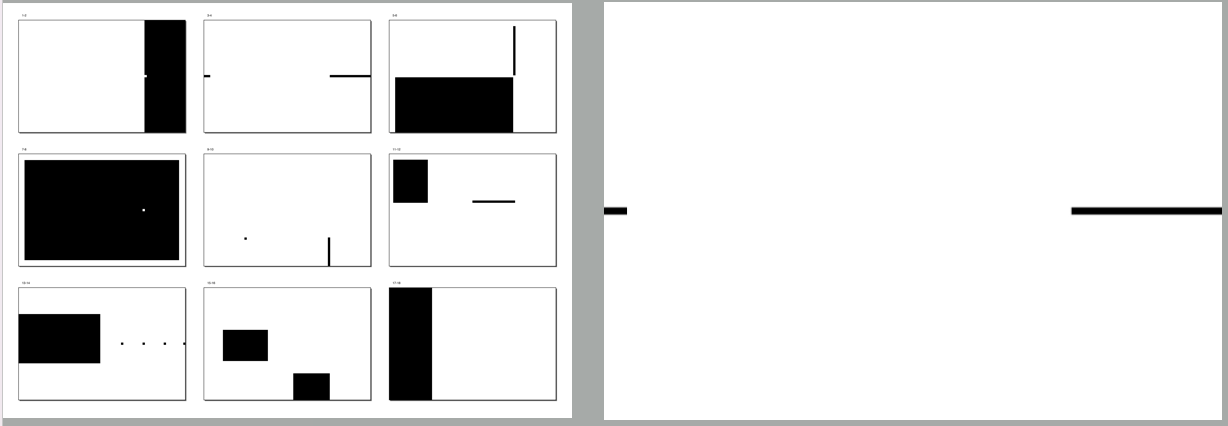
In this exercise, we are instructed to come up with 8 layout designs using different typographic systems.
This is the text I choose for the exercise
The Design School,
Taylor’s University
All Ripped Up: Punk Influences on Design
Open Public Lectures:
June 24, 2021
Lew Pik Svonn, 9AM-10AM
Ezrena Mohd., 10AM-11AM
Suzy Sulaiman, 11AM-12PM
June 25, 2021
Lim Whay Yin, 9AM-10AM
Fahmi Reza, 10AM-11AM
Manish Acharia, 11AM-12PM
Lecture Theatre 12
8 typesetting systems are the first attempt (28/9/2024)
Process:
At first, I didn't know what an axial system was. I went to watch the teacher's tutorial, and then tried to do typesetting. With the red circle as the center, the text formed a radial structure around the new layout. The source dynamic perspective design combines the concepts of movement and center focus, emphasizing the central point enhancement and visual concentration.
fig1.1 Axial system JPEG (25/9/2024)
Radial system, I arrange it in a circular path to form an appearance similar to a record or logo. The cover design of the inspired record has a punk atmosphere, and at the same time, the design is personalized.
fig1.2 Radial System JPEG (25/9/2024)
fig1.3 Dilatational System JPEG(25/9/2024)
Random system, there is an obvious contrast between the graphic elements, the text is scattered but there is a visual connection between the origin, finding balance in the chaos and echoing the experimental spirit of punk culture, highlighting the theme tension.
fig1.4 Random System JPEG (25/9/2024)
Based on a strict grid layout, Grid System emphasizes the rules of design and a sense of order. Inspired by the Swiss design style, it emphasizes the informationality of alignment and information transmission to bring a calm and rational visual experience.
fig 1.5 Grid System JPEG(25/9/2024)
Transitional system, text spreads to both sides of the center, and there is a kind of solar radiation or extended composition method that emphasizes extensibility.
fig 1.6 Transitional System JPEG(25/9/2024)
Modular System, typesetting forms symmetry, changing composition, combined with modern constructivism, retains a sense of order and flexibility.
fig 1.7 Modular System JPEG (25/9/2024)
Bilateral System Graphics and text nest materials with each other, and the overall combination of pictures and texts forms a kind of integrity and harmonious beauty.
fig1.8 Bilateral System JPEG(25/9/2024)
Sum up:
These eight typesetting systems show different visual expressions from rational to sensibility. The design reflects:
The rebellion and freedom of punk culture.
The geometric order and experimentality of constitutiveism.
The combination of visual impact and information transmission
fig1.1 final Axial system JPEG (25/9/2024)
fig1.2 final Radial System JPEG (25/9/2024)
fig1.3 final Dilatational System JPEG(25/9/2024)
fig1.4 final Random System JPEG (25/9/2024)
fig 1.5 final Grid System JPEG(25/9/2024)
fig 1.6 final Transitional System JPEG(25/9/2024)
fig 1.7 final Modular System JPEG (25/9/2024)
fig1.8 final Bilateral System JPEG(25/9/2024)
The final PDF
task 1 Fig 1.9 The final design PDF(1/10/2024)
task 1 Fig 1.10The final design PDF(1/10/2024)
The second job was to find photographs of either natural or man-made objects in order to create a font. We must examine, evaluate, and determine the texture and ornamentation created by natural occurrences based on the image that we have found. Extract the probable forms from the image for font design and endure the iteration dissection to make the crude font to a well-refined font without losing its inherent characteristic and origin.
| Fig 2.1 The Jpeg image found on Pinterest.(1/10/2024) |
Fig 2.2 Letter withdrawal (1/10/2024)
According to the teacher's request, I found a picture on Pinterest, and then I extracted the letters. I found the letters FLEWTV according to his logic. |
Fig 2.3 TC Garamond Std Bold (1/10/2024)
After the successful extraction, I used the 10 fonts given by the teacher last semester, one font as a reference and the other font as a reference.
Fig 2.4 The first stage of font extraction(1/10/2024)
I'm using AI software to extract letters from the graphics and put them on the reference letters to modify and extract the first stage of fonts. Through observation, I found that my font is biased towards serif font, so I will retain the original characteristics of the font in the next stage and modify it.
Fig 2.5 The results extracted for the first time(1/10/2024)
Fig 2.6 The results of the second revision(1/10/2024)
In this modification, I want to keep the original appearance of the font and make a slight modification to make it more standardized.
Fig 2.7 Teacher's modification example(9/10/2024)
The teacher suggested that I use hexagon to design my font according to the graphic features I chose. The corners of the hexagon are too sharp, so I smoothed the hexagon.
Fig 2.8 The final product(9/10/2024)
According to the teacher's feedback, I completed the final design. We require this font to design the poster.
final product
Fig 2.9The final product(9/10/2024)
Fig 2.10The final product PDF(9/10/2024)
Part 2: Types and images
The design of this poster is inspired by the combination of mobility and order. I used hexagons as the main typesetting elements, symbolizing structure and stability, while giving them different colors to express the beauty of diversity and change. Hexagons themselves are common shapes in nature, with strong visual impact. They are neatly arranged, which has not only a sense of mathematical precision, but also a lively and agile atmosphere.
Fig 2.10 original poster design(9/10/2024)
The background part uses gradients and abstract lines to create a fluid and dynamic effect. This sense of flow echoes the theme "FLOW" of the poster, symbolizing that the inspiration of the design is like the flow of water, free and directional. The transition of gradient color reflects the natural transformation of color, implying the continuous change and integration of ideas in the design process.
Modified version
The teacher's feedback to me this week is that my choice of poster is not suitable. My font is about hexagon, so my poster has nothing to do with my font.
| fig2.11 Poster image selection(16/10/2024) |
The teacher said that my first poster selection was not related to my font, because I used hexagon as the font selection, so I chose the rectangular image to modify it again.
| fig 2.12 Poster image selection(16/10/2024) |
| fig 2.13 Font information layout(16/10/2024) |
fig 2.14 Heading(16/10/2024)
fig 2.15 Information/10/2024)
Under the guidance of the teacher, I quickly understood that the information to be conveyed by the font, the image and the poster should be connected and achieve each other.
Final Submission Exercise 2_Type&Play
Figure 2.16 Final Submission Exercise 2A_Type&Play, JPEG, 09/10/2024
| fig 2.16 Discovery type poster final version(16/10/2024) |
Minimalism and modernity are my important considerations in this design. I hope to convey clear visual information through concise graphics and clear typesetting, while leaving enough space for the audience to perceive the mobility and openness of the work. This design method not only shows my thinking about order and chaos, but also expresses my understanding of future design trends - looking for simplicity in complexity and finding dynamics in static.
This poster design tries to tell a story about balance and change through visual elements, expressing the flow of inspiration and continuous evolution in the design process.
Final PDF
fig2.18 Discovery type poster final version PDF(16/10/2024)
Week1:
General feedback::
Look at previous work before starting task 1 to get a better idea of this task .
Week2 :
Specific feedback:
The spacing between paragraphs in the grid system were excessively wide, so it was advised to raise the text's leading to make the negative space appear more balanced. I have to make sure that the shape in the wavy lines is exactly inside the text cells for the modular system to function. I must be aware of the application of non-objective structures in order to deal with the radial system. When it comes to the horizontal arrangement, steer clear of the boxy visual impression for the transition system to function. In summary, the entire piece was beautiful and superb. Avoid making the text bold, underline, and italic all at once; one or two text effects should be enough to establish a strong visual hierarchy.
General feedback: Lecture reminded us that the latest work must be uploaded once we have done the correction on the error. As usual, the blog should always be updated to avoid the accumulation of workload. The progress works must be included in the blog in JPEG format with clear captions but not simply the screenshot images.
Week3:
Specific feedback:The teacher asked me to use rectangular patterns to create and modify my font to make it more in line with the essence.
General feedback: Our professor emphasized to us that a typeface needs to reach a specific level of refinement in order to look well-modified without losing its inherent characteristics. If the possible font has too many features, we should limit our selection to one feature to keep the font design cohesive visually.
Week4:
Specific feedback:The teacher's feedback to me this week is that my choice of poster is not suitable. My font is about hexagon, so my poster has nothing to do with my font.
These weeks of study have made me gradually realize the importance of details in design to the overall work. Through the teacher's feedback, I reflected on my layout problem in the grid system. During Week 2, the teacher pointed out that I was too loose in paragraph spacing, which made me realize how to balance the negative space by adjusting the line spacing of the text and optimize the visual feeling of the layout. At the same time, the shape of wavy lines in the module system requires me to accurately control them to ensure that they are strictly located in the text unit, which reflects the pursuit of fineness. In addition, the teacher also reminded me to pay attention to the application of targetless structures, which is a big challenge to the radioactive system. When arranging horizontally, I need to avoid a sense of squares to make the transition system smoother and more natural.
These specific feedbacks made me realize that design is not only about creativity, but also about polishing details. The establishment of visual layers should be concise and powerful, and avoid too much effect superposition, such as the simultaneous use of bold, underline, italics, etc. By limiting the effect, I can convey information more effectively and avoid the visual fatigue of the audience.
In Week 3, I learned about the importance of complexity and simplification in font design. By using rectangular patterns to design and modify fonts, I have a deeper understanding of the consistency of the essence and appearance of the font, and through this process, I have paid more attention to the details of the font. In reflection, I realized that it is very important to maintain the inherent characteristics and style of the font in the design, while making it visually coherent.
In Week 4, the teacher pointed out that my poster choice did not match the font design. My font was inspired by hexagons, but the poster did not fully reflect this feature. This feedback made me realize the importance of the unity and theme relevance of visual design. Each design element should have a reason for its existence and be consistent with the overall design language and theme.
Summarizing these feedbacks and learning, I deeply realize that in the design process, we should not only maintain creativity, but also pay attention to the accuracy and consistency in the design.
Further Reading
Figure 20.1 Elam, K. (2007). Typographic Systems. Princeton Architectural Press, New York
Axial SystemDietmar Winkler uses a single curved axis to complete the shape of the bell of a horn in his poster for the program Music for Brass.Emil Ruder's single-axis poster 10 zurcher maler (10Zürich Artists) uses the strong vertical stress of the number 1.The emphasis on the vertical movement is increased because the stroke bleeds off of the top the poster and is connected to the "h" The proportions of the poster are divided vertically by the 1 and column of names in a pleasing 1/3:2/3 ratio.
Fig Axial System
The axial system is easily understood and helps the designer develop a keen awareness of grouping, word space, lette)space, leading,and composition. The elements have a di-rect relationship to each other through alignment along the axis,and the message has an inherent sense of order. lt is relatively easy to create an appealing composition, but more difficult to create a composition that transcends the norm.Fig axial system
Radial System
In the radial system all elements are organized to extend froma central point of focus like rays.Examples include the petals of flowers, fireworks, domes in architecture, rays of the sun, spokes of a wheel, starfish, etc. The compositions are dynamic, as the eye is drawn to the focal point of the radia composition.This point can be implied or depicted.
Depending on the orientation of the lines, readability of them essage may be diminished as the type leaves the traditiona horizontal baseline. Within this system lines of text can bear ranged to read in a number of different ways: top to bottom, bottom to top, right side up, or upside down.In or deto create a functional message, the lines of text should bear ranged in the most comfortable manner possible.
Most examples of radial structure are highly symmetrical such as flowers,architectural domes, and starfish.Because the rays create a circle, the forms are visually very satisfying.When working with text,the resulting compositions often contain portions of a single circle or many circles. There sulting asymmetry is less satisfying and more visually interesting.
Fig Radial System
Dilatational System, IntroductionIn a dilatational system circles dilate or expand from a centrapoint.Examples of this system include the iris of the eye, the waves created when a pebble is dropped into still water, ancsound waves.Similar to the radial system, the composition sare dynamic as the eye moves along the arc of the circle oris drawn to the focal point at the center of the circle.
The simplest forms of the dilatational system are circles that expand in regular or rhythmical increments from the center. Variations of this system can include dilations that are tangent, dilations that are non-concentric, and multiple dilations.
Fig Dilatational System
Fig Dilatational System
Random System
The random system consists of elements that are arrangedwithout definite aim, pattern, direction, rule, method orpurpose, but it is deceptively simple because the viewerimposes organization on compositions even when it is unin-tentional.The human eye and brain are keenly programmed to be pattern-seeking,image-seeking, and order-seekingbecause these abilities insured survival in early man. Focenturies humans have found images in the constellations of stars in the sky or in cloud formations
Work is often be qun by scattering elements in the compositional field with free abandon.Inevitably, some of those ele. ments align and the composition feels intentional. Successis more frequent when legibility diminishes with cropping,overlapping, and placing text at odd angles, which are cues otrandomness.Surprisingly,random placement often yields avery dynamic and spontaneous result that, although difficultto read, is visually satisfying.
Fig Random System
Fig Random System
Grid System
A grid is a system of vertical and horizontal divisions thatorganize and create relationships between elements. Gridsystem arrangements are usually formal and are intendedto create visual order and economyin production.Examplesof grid systems include windows, maps, and crossworopuzzles. Grids are frequently used in publication designand web design as they guide information hierarchies ancpromote visual rhythm and consistency among multiplepages or screens.
The objective in organizing visual communication with the grid system is to develop strong interrelationships between the typographic elements and recurring rhythmical proportions of text blocks,images, and space. Grid systems differ from the axial system in that the visual relationships are nottied to a single axis and usually employ more than a single column.
Fig Grid System
Fig Grid System
Transitional System
The transitional system of visual organization is an informa system of layered and shifted banding. There are not interrelationships along an axis or edge alignments, and elements move freely left and right. This is a far more casual system than the grid system in that strict interrelationship through edge alignment is not desirable. The lines of type are free flowing and the textures they create assist in ordering the message.Examples of natural transitional arrangement sinclude strata of layered rock or casually stacked wood,
Compositions can be airy and widely leaded or tightly compact,which emphasizes the negative space. This system often results in compositions that echo fine art in that many have the visual feel of a landscape, which is admittedly enhanced by the use of the circle element that becomes an abstract sun or moon.
Fig Transitional System
Modular SystemThe modular system is dependent on standardized nonobiective elements or units that act as a ground to hold anccontain text.Compositions are created by the organizatiorand placement of the modular units.Examples of the modular system include building blocks, storage containers, andcomponent systems.
Typographic lines and words have a distinctlyindividual formthat defy standardization and require a module that acts asa ground.Modules can be as simple as a hairline square orectangle or more complex geometric shapes such as circlesellipses, triangles, etc.
The idea is to standardize the unit on which the typographyrests and then compose the message with the modulesLines of type can be broken or split into multiple lines awill, which, like grouping,assists in communicating themessage.
Bilateral SystemThe bilateral system is the most symmetrical of the visuaorganization systems.lt consists of a single axis with linesof text centered on the axis.Examples of the bilateral system include the human body, butterflies, leaves, and manyanimals and man-made obiects
As the most symmetrical system, the bilateral system is themost challenging compositionally. This is due to the inher-ent symmetry that makes theseCompositions predictablePlacing the axis off center inand potentially uninteresting.the format can immediatelymake the compositon moredynamic.A diagonal axis can bring a bit more visual interestto the composition, as does moving a line of text diagonallyoff of the baseline.The addition of nonobjective elements tothe composition can transform the work to one of heightenedvisual interest.


Comments
Post a Comment