Typography - Task 3: Type Design & Communication

10.06.2024 - / Week 9 - Week
HUANG JIAQI/ 0371553Typography / Bachelor of Design (Hons) in Creative Media
Task 3: Type Design & Communication
Table of contents
2.Instructions
3.Work progress
4.Feedback
5.Reflections
6.Further reading
1.Lectures
All lectures are completed in Task 1: Exercises 1 & 2
Week 7:Task 2 -Type Expression and Formatting -Exercise 1&2
-Task 1 Exercise 1&2
This is mine MIB
In this task, we were instructed to do a detailed dissection of the letters "H", "o", "b" and "g" by using Adobe Illustrator. We need to select a preferred font from teh 10 fonts provided.
Work progress
Before I started, I searched the Internet.
The letter strokes in some objects have decorative details that become serifs. Fonts with serifs are called serifs, and fonts without serifs are called sans-serifs.
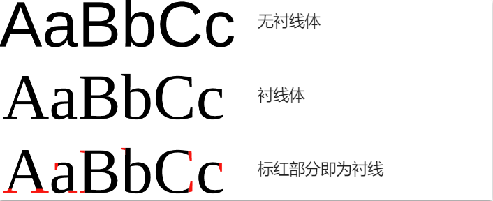 |
| Fig 1.1 serifs and sans-serifs. |
 |
| Fig 1.2 basic knowledge |
 |
| Fig 1.3 basic knowledge |
 |
| Fig 1.4 basic knowledge |
serifs
1. Bodoni is a famous serif font that came after Didot. The two fonts are often compared side by side. Bodoni's strokes are bolder while retaining the elegant glyphs. The ease of use is much higher than Didot.
 |
| Fig1.5 serifs of Bodoni |
 |
| Fig1.6 serifs of Trajan |
3.Helvetica is a sans-serif typeface widely used in the Latin alphabet, designed by Swiss designers Max Miedinger and Eduard Hoffmann in 1957. Made for typesetting.
 |
| Fig1.7 serifs of Helvetica |
Select a preferred font from the 10 fonts provided. Using the following letters H,o,g,b,
do a detail dissection of the letters (write observations in eportfolio),In comparison, my design is the most similar to Gill Sans font.

Fig1.8 Alphabet analysis
Gill Sans is a sans-serif font designed by British font designer Eric Gill in 1928. It is famous for its concise and clear appearance. It is a very classic font that is widely used in various designs and typesetting.
A family of humanist sans-serif typefaces with a distinctly British concept and feel is called Gill Sans. Gill Sans, created by the gifted Eric Gill at the start of the 20th century, is a sans-serif font that has stood the test of time. It is modeled after the form and proportion of Roman characters, but it also has unique modern features and a warm touch.

Fig1.9 Alphabet analysis
Gill Sans

Fig1.10 Alphabet analysis
There is an unevenness in the "o" circle, with the right side slightly thicker than the left.

Fig1.11 Alphabet analysis
The letter "g" shows a more complex dissection. The upper loop is stretched out horizontally. The stroke of the link is thinner in the upper connected part. The lower loop is a horizontally symmetric ellipse. The ear has the same thickness of the stroke.

Fig1.12 Alphabet analysis
the closed counter of the letter 'b' is not the same as the size of the bowl outside
Jill Sands is a timeless and adaptable sans-serif typeface in general. It excels in a variety of applications thanks to its straightforward and expressive design.
Sketch
Task instruction
material: Graph paper + 3 marker pens (your choice but must be 3.0 above)
Task 3:
- Select a preferred font from the 10 fonts provided. Using the following letters H,o,g,b,
do a detail dissection of the letters (write observations in eportfolio)
- Sketch the following letters HOGB / hoob using the 3 pens.
Explore 3 different writing styles for each of the 3 pens.
Sketches

| sketches1.1(11/06/2024) |

| sketches1.2(11/06/2024) |

| sketches1.3(11/06/2024) |
I found that I used serif a lot in my work, but after understanding the bauhans principle I will Continue to use sans serit as a design Principle, I chose the second of the third draft as the final draft, and got feedback and comments from the teacher.

fig 1.4 The sketch given by the teacher(11/06/2024)
The teacher pointed out that my design needs to be more regular and consistent. For example, the thickness of the strokes needs to be unified, and the spacing between the letters also needs to be consistent.The teacher mentioned the identification and application of key features in font design, such as baseline and x-height. These features are very important for maintaining the balance and consistency of fonts.

After finishing my final sketch, I determined my style and began to explore the digitalization process in AI software.

fig 1.6 digital sketch(12/06/2024)

fig 1.7 digital sketch(16/06/2024)
The teacher said that we should pay attention to maintaining the same angle of all letters, carefully consider the disconnection of the strokes, and ensure the unity of the design.

Specific feedback on specific letters:
The letter 'G' needs special attention to ensure that its angle and style are consistent with other letters.
Other letters may also need to be adjusted to meet the overall design and angle.

fig 1.9 digital sketch(26/06/2024)
I made the modification according to the teacher's feedback.Get new feedback in the 11th week:try to have the stencil cut to be more prominently, for it is the key feature of this typeface.
At the end of the digitization, I started to learn about fontlab.

fig 1.10 Practice font lab(2/07/2024)

fig 1.11 Practice font lab(2/07/2024)

fig 1.12 Practice font lab for the first time(2/07/2024)
I modified it according to the teacher's feedback. Get new feedback in week 11: Try to cut the template more prominently, because this is a key feature of this font.
The teacher asked me to refer to the value of Mr Vinod after reading my font.

Fig 1.13 Side bearing reference(16/07/2024)
I began to modify my value according to Mr. Vinod's reference. The teacher said that my font height was not uniform, so he taught me how to modify it.

Fig 1.14 Adjust the value(16/07/2024)

Fig 1.15 Uniform height (16/07/2024)
Under the guidance of the teacher, I adjusted my parameters and the font size.
Final Compilation
I named my font Angel.

fig1.16 FontLab Screengrab(16/07/2024)
| fig 1.17 Final Task3 Type Design and Communication,Ai jpg(16/07/2024) |
| fig 1.18 Final Task3 Type Design and Communication,Ai pdf(16/07/2024) |

| fig 1.19 Final Task3Black a poster jpg(10/07/2024) |
| fig 1.20 Final Task3Black Poster poster pdf(10/07/2024) |

| fig 1.21 Final Task3 white poster jpg(10/07/2024) |
| fig 1.22 Final Task3 white Poster poster pdf(10/07/2024) |
4.Feedback
week 9:The importance of baseline and X height:
The teacher pointed out the key role of baseline and X height in font design. These lines are used to ensure the alignment and high consistency of letters, and are the basic elements in the design.
Design consistency and regularity:
The teacher emphasized the consistency and regularity in the design. The stroke thickness and spacing of the letters need to be unified, and there should be no irregular elements in the design.
week10:When writing, pay attention to keeping the angle of the letters consistent, consider the design possibility of disconnecting strokes, unify the style and proportion of letters, and improve your writing quality through continuous practice and research.
Specific feedback on specific letters:
The letter 'G' needs special attention to ensure that its angle and style are consistent with other letters.
Other letters may also need to be adjusted to meet the overall design and angle.
week11:try to have the stencil cut to be more prominently, for it is the key feature of this typeface.
Week 12:
GENERAL FEEDBACK:
- should start trying to work on fontlab
week13:Modify the font according to the parameters released by the teams teacher and start with the letters "H" and "O", because these are usually used as reference points for other glyph spacing.
5.Reflections
WEEK 9
Application of baseline and X height:
In the early stage of the design, I did not have a deep understanding of the concepts of baseline and X height, which led to problems with the alignment and height of letters. In the future, I will give priority to these basic elements in the design to ensure that each letter meets these standards.
Consistency of design:
In my preliminary design, the stroke thickness and spacing of the letters are not consistent enough, resulting in insufficient coordination in the overall design. Through the teacher's feedback, I realized the importance of consistency and improved it in the subsequent design to ensure that the strokes and spacing of all letters are unified.
week10:
When writing, pay attention to keeping the angle of the letters consistent, consider the design possibility of disconnecting strokes, unify the style and proportion of letters, and improve your writing quality through continuous practice and research.Specific feedback on specific letters:
The letter 'G' needs special attention to ensure that its angle and style are consistent with other letters.
Other letters may also need to be adjusted to meet the overall design and angle.
week11:
The teacher pointed out that template cutting is the core feature of this font, so special attention needs to be paid to it. In order to make these cuts more prominent, I need to study how to better display this feature in the design.In order to highlight template cutting, I need to do a lot of practice, try different design methods, and adjust and improve according to the results. This can not only improve my design ability, but also allow me to better understand and apply the principles of font design.
week12:
In a recent course, I began to learn to use FontLab, a professional font design software. Through a period of practice and exploration, I have gained some experience in the use of FontLab, and also reflected on my advantages and shortcomings in the learning process.
In the process of learning, I also found some of my shortcomings. First of all, the mastery of software functions is not comprehensive enough. FontLab's functions are very powerful, and I have only mastered the basic operations in a short time, and many advanced functions need to be further studied and explored.
week13:
In modern design, font typesetting plays a vital role. Strict font typesetting requirements can ensure the visual beauty and readability of design works. Different fonts and typesetting methods will directly affect the visual experience of the audience. By choosing the appropriate font, font size, line spacing and spacing, we can improve the readability of the text and make it easier for the audience to obtain information. At the same time, well-designed typesetting can enhance the beauty of the work and attract the attention of the audience.
week14:
Learning font design made me realize the importance of fonts in conveying information and emotions. Through practice, I have improved my sensitivity to details and typesetting, and created works with more visual impact.
6.Further reading

It is often useful to think of your text area divided into columns - consistent horizontal intervals that allow for more than one fieid of text per page. Working with columnar layouts heips you maintain a manageable line length and allows white space onto the page in piaces other than the margins. Keep in mind the dynamic relationship between type size, leading, and line length.
Horizontal layouts allow for wider fields of text, which tend to support sustained reading more comfortably than narrower fields.Columnar layouts are effective for many different formats. Above, a three-column layout is applied to each of the three panels on an 8.5 x 11 in (216 x 279 mm) sheet.
Cross-aligning headlines and captions with text type reinforces the architectural sense of the page-the structure -while articulating the complementary vertical rhythms. In this example, four lines of caption type (leaded to 9 pts.) cross-align with three lines of text type (leaded to 13.5 pts.).


Figure 1.0 Basic principles of legibility (Page 57-58)
This chapter of the book discusses how to utilise the grid and how each letter's form is determined by how many different points it has. The resolution improves with additional points.

Figure 1.1 The evolution of typographic technology: Digital typesetting (Page 128)
I opted to read this page after coming across this chapter while quickly perusing the book. The pixelated lettering on this page caught my attention. I've discovered that pixel fonts can be helpful for little on-screen writing since their pixelated appearance maximises readability. They are frequently used as display fonts since they are also recognised for communicating computer technology (because of their appearance).

Figure 1.2 Typography on screen: Rendering type on screen (Page 136)


Comments
Post a Comment