ILLUSTRATION AND VISUAL NARRATIVE - Final Compilation and Reflection

2/07/ 2024
Time frame Week 1 - Week14
Huang Jiaqi/0371553
Bachelor of Creative Media Design
Tasks
- Task 1 ILLUSTRATION AND VISUAL NARRATIVE / TASK 1 : EXERCISES
- Task 2 - ILLUSTRATION AND VISUAL NARRATIVE /TASK 2: DECISIVE MOMENT
- Task 3 - ILLUSTRATION AND VISUAL NARRATIVE 3 / Final Project: Comic cover and Animated One Page intro
- Reflection
Practice
Vormator is the ultimate challenge of your creativity: the aim of project is to give each student the chance to show their ability to create a stunning piece with limited means.
Each person will get the exact same set of , the . With these shapes you are challenged to create your own unique design, within the limitations provided in the Rulebook. Designers are thus challenged to create a unique piece within a strict set of rules. It all comes down to pure skills and creativity in this project.
Each person will get the exact same set of , the . With these shapes you are challenged to create your own unique design, within the limitations provided in the Rulebook. Designers are thus challenged to create a unique piece within a strict set of rules. It all comes down to pure skills and creativity in this project.
According to the homework requirements given by the teacher and the relevant graphics, I created my own role.
The sketch process

fig 1.3 Design ideas
Final design
Because I like jellyfish very much, I built the character of a monster based on jellyfish.

week 4 :Light and Shadow
Chiaroscuro Exercise
- An Italian term which literally means 'light-dark'
- To study light and shadow of an object
- Applying skills and techniques learned in previous class (Pathfinder tool, Blending Mode, Knife tool, Pen tool, Simplify)


fig 1.6 Homework exercises

fig 1.6 Homework exercises
Task 2: Pokemon Card Composition
Objective: Place your Vormator character into a Pokemon card composition, incorporating foreground, midground, and background elements. You may also create a new shape not bound by the vormator rules or shapes.
Tools to Use: Pathfinder, Shape Builder tool, Knife tool. You may also use other warping tools that will be introduced in the following weeks


fig1.8Background

| fig1.9 Pokemon card |

| fig1.10 Final design Pokemon card |
week7:
At the teacher's suggestion, I simplified the background design, reduced the use of colors and patterns, and ensured that the background did not distract attention from the main content, but complemented the foreground elements. I ensured that all elements (text, images and borders) were correctly aligned and maintained margins and spacing, so as to improve the overall beauty and readability. I ensured that all elements (text, images and borders) were correctly aligned and maintained consistent margins and spacing, so as to improve the overall beauty and readability.

fig1.11 Final design Pokemon card
Stats
Attack: 80
Defense: 70
Special Attack: 90
Special Defense: 80
Speed: 60
Ability Ratings
Fear Intimidation: ★★★★☆
Toxin Control: ★★★★☆
Shadow Stealth: ★★★★☆
Mental Disruption: ★★★★☆
Life Drain: ★★★★☆
Summary
Sony, a Ghost/Poison type Pokémon, is known for its eerie appearance and powerful mental disruption abilities. Composed of void energy, it excels in lethal poison attacks and instilling fear. Sony's key abilities include Void Toxin, Eye of Terror, Shadow Sneak, Life Drain, and Mental Disruption. It is a formidable adversary, offering trainers a powerful ally in battle.
Chiaroscuro Exercises

fig1.12 Chiaroscuro Exercises
Task 2: Decisive Moment
Assignment 1: Fly Me To the Moon1.1 Album cover1.2 Animated album cover
week 9
Assignment 1 Fly Me To The Moon
For the animated album cover project, I chose the song "Fly Me to the Moon". The cover will be based on the theme of romantic space travel, and the storyline shows a pair of lovers dancing and landing on the moon in space. The foreground includes lovers, and the background is the moon and the starry sky. Illustrations and animations will contain exquisite fonts and delicate mobile effects to convey the sense of fantasy and adventure in the lyrics. The submission includes preliminary ideas and sketches, illustrations, and the final animated GIF.
Task 2: Decisive Moment
Assignment 1: Fly Me To the Moon
1.1 Album cover
1.2 Animated album cover
week 9
Assignment 1 Fly Me To The Moon
For the animated album cover project, I chose the song "Fly Me to the Moon". The cover will be based on the theme of romantic space travel, and the storyline shows a pair of lovers dancing and landing on the moon in space. The foreground includes lovers, and the background is the moon and the starry sky. Illustrations and animations will contain exquisite fonts and delicate mobile effects to convey the sense of fantasy and adventure in the lyrics. The submission includes preliminary ideas and sketches, illustrations, and the final animated GIF.
reference
 fig1.13 Refer to
 fig1.14 Refer toPreliminary inspiration
The iconic song Fly Me to the Moon served as the inspiration for this design, which aims to evoke a romantic and fantastical space voyage. A pair floating in the starry sky is depicted in the center of the image. Their cozy poses and organic postures represent tender love. The addition of aurora, nebula, and flashing stars to the background enhances the image's hierarchy. If you want to create a romantic and dreamy ambiance, use gentle gradient colors like pink and lavender. The couple's stunning and distinct lunar silhouette is encircled by tiny stars, which highlights the beautiful features. Vibrant colors and decorations in the foreground flowers below the image enhance the entire design. The narrative and dynamics of thedynamic features like balloons fluttering and meteors passing improve the scene. Put the words "Fly Me to the Moon" at the top or bottom of the image. Use Art Deco typefaces with glowing-effects to bring the whole thing together and create a distinctive, eye-catching design.
Sketch
 fig1.15 Sketch
After determining my own ideas, I began to digitize and try to draw it on the software.
 fig1.16 Digitize
This is the preliminary finished product I completed according to the preliminary idea. I found the shortcomings in my observation of the picture and in-depth exploration, so I made the modification.
Final design
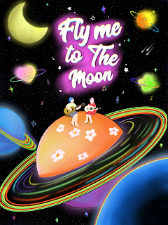 fig 1.17 Final design
fig1.13 Refer to
fig1.14 Refer to
Preliminary inspiration
The iconic song Fly Me to the Moon served as the inspiration for this design, which aims to evoke a romantic and fantastical space voyage. A pair floating in the starry sky is depicted in the center of the image. Their cozy poses and organic postures represent tender love. The addition of aurora, nebula, and flashing stars to the background enhances the image's hierarchy. If you want to create a romantic and dreamy ambiance, use gentle gradient colors like pink and lavender. The couple's stunning and distinct lunar silhouette is encircled by tiny stars, which highlights the beautiful features. Vibrant colors and decorations in the foreground flowers below the image enhance the entire design. The narrative and dynamics of thedynamic features like balloons fluttering and meteors passing improve the scene. Put the words "Fly Me to the Moon" at the top or bottom of the image. Use Art Deco typefaces with glowing-effects to bring the whole thing together and create a distinctive, eye-catching design.
Sketch
fig1.15 Sketch
After determining my own ideas, I began to digitize and try to draw it on the software.

fig1.16 Digitize
This is the preliminary finished product I completed according to the preliminary idea. I found the shortcomings in my observation of the picture and in-depth exploration, so I made the modification.
Final design

fig 1.18 Final design GIF
Concept of design
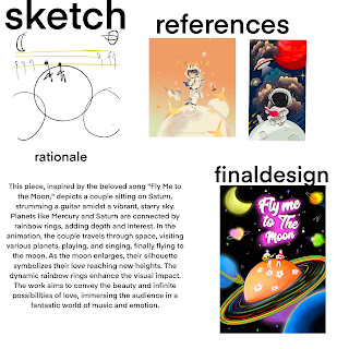
fig 1.19 The final process
This piece, which draws inspiration from the beloved song Fly Me to the Moon, attempts to convey a beautiful and surreal space voyage by fusing several forms of expression—music, art, and emotion. A couple sitting on Saturn, decked out in white flowers, and strumming a guitar forms the central motif of the piece. The entire image is filled with a vibrant, starry sky that is encircled by sparkling stars, creating a fantastical, cosmic environment.
The composition of the picture is meticulous and rich. Mercury, Saturn and other planets are connected by rainbow rings, which not only increases the sense of hierarchy of the picture, but also adds dynamic and interest to the overall design. In the animation design, couples will travel through space, pass through various planets, stop to play and sing, and finally fly to the moon. As the moon gradually enlarged, the couple's silhouette came into view, symbolizing that their love has reached a new height. In this process, rainbow-colored planetary rings will also be dynamically presented, further enhancing the visual impact.
I hope that through this design, it will not only show a romantic and fantastic cosmic adventure, but also convey the beauty and infinite possibilities of love. The whole work strives for perfection in color application, element layout and dynamic effects, aiming to make the audience feel a space journey full of surprise and emotion. In terms of visual and emotional aspects, the works strive to achieve a high-level artistic expression, so that the audience can immerse themselves in the wonderful world of music and love in the process of appreciation.
Design project description
Recommended art style
For this project, I chose the style of Pop Art. With its bright colors, unique patterns and playful expressions, Pop Art perfectly fits the dreamy and romantic theme of the song Fly Me to the Moon.
Originality
My design is unique and suitable. By combining romantic space travel with the art style of pop, I create a world full of fantasy and emotion. The couple's interstellar adventure not only highlights the theme of the song, but also gives the picture more story and visual impact.
Skills
I have shown solid basic skills in composition, illustration style and proposals. Through the color application and concise lines of pop art, the visual attraction of the work is enhanced, while maintaining the simplicity and freshness of the picture. Every detail is carefully designed to ensure the unity and beauty of the overall style.
Explanation - How to interpret a song as an illustration
Fly Me to the Moon is a song that expresses romance and dreams. I transformed this emotion into a visual expression by depicting the couple's journey in space. The design of the starry sky, planet and moon not only echoes the theme of "flying to the moon" in the song, but also shows the intimacy and romantic atmosphere between couples through details.
Storytelling - Does your proposal tell a story? Do you show emotion?
My proposal tells a romantic space travel story full of emotions. Couples travel between stars and stop to play and sing everywhere, showing their sweetness and romance. The dynamic rainbow-colored planetary rings and the flickering effect of the starry sky make the whole story more vivid. The couple's posture is naturally intimate, showing strong emotions, rather than a blank expression.
Requirements - Initial Storyline, Idea + Sket | Illustration | Final Animation GIF
Initial storyline
The couple decided to embark on a romantic space trip and fly to the moon. During the trip, they passed through different planets and stopped everywhere to enjoy each other's company and the beauty of music. On Saturn, they stopped to play and sing, enjoying the beauty of space and each other's existence. Finally, they reached the moon, and the moon gradually zoomed in, showing their silhouettes, symbolizing that their love had reached a new height.
Ideas + sketchesfig1.20 Sketch
The initial sketch depicts the scene of couples on different planets, with flashing stars and colorful planetary rings in the background. Each planet has unique decorations, such as the white flowers on Saturn.
fig1.21 DigitizeIllustration
The illustrations refine the details of each scene, increasing the hierarchy of the starry sky and the flashing effect of the stars. The couple's posture and expression have been adjusted to be more natural and intimate. In terms of color application, a soft gradient color is added to make the picture more dreamy.
Final animation GIF
fig 1.22 Final design GIF
Animated GIF enhances the expressiveness of the story through dynamic effects. The couple traveled through space, passing through Mercury and Saturn. The rainbow-colored planetary rings moved in the animation, and the couple's dress and hair swayed in the wind, and finally flew to the moon. The moon is enlarged, showing the silhouette of the couple. The whole process is full of movement and emotion, perfectly showing the romantic theme of the song Fly Me to the Moon.
Through these design elements and steps, I hope to not only convey the romantic feelings of the song, but also immerse the audience in this fantasy and emotional cosmic adventure through the expression of dynamics and colors.

fig 1.18 Final design GIF
Concept of design

fig 1.19 The final process
This piece, which draws inspiration from the beloved song Fly Me to the Moon, attempts to convey a beautiful and surreal space voyage by fusing several forms of expression—music, art, and emotion. A couple sitting on Saturn, decked out in white flowers, and strumming a guitar forms the central motif of the piece. The entire image is filled with a vibrant, starry sky that is encircled by sparkling stars, creating a fantastical, cosmic environment.
The composition of the picture is meticulous and rich. Mercury, Saturn and other planets are connected by rainbow rings, which not only increases the sense of hierarchy of the picture, but also adds dynamic and interest to the overall design. In the animation design, couples will travel through space, pass through various planets, stop to play and sing, and finally fly to the moon. As the moon gradually enlarged, the couple's silhouette came into view, symbolizing that their love has reached a new height. In this process, rainbow-colored planetary rings will also be dynamically presented, further enhancing the visual impact.
I hope that through this design, it will not only show a romantic and fantastic cosmic adventure, but also convey the beauty and infinite possibilities of love. The whole work strives for perfection in color application, element layout and dynamic effects, aiming to make the audience feel a space journey full of surprise and emotion. In terms of visual and emotional aspects, the works strive to achieve a high-level artistic expression, so that the audience can immerse themselves in the wonderful world of music and love in the process of appreciation.
Design project description
Recommended art style
For this project, I chose the style of Pop Art. With its bright colors, unique patterns and playful expressions, Pop Art perfectly fits the dreamy and romantic theme of the song Fly Me to the Moon.
Originality
My design is unique and suitable. By combining romantic space travel with the art style of pop, I create a world full of fantasy and emotion. The couple's interstellar adventure not only highlights the theme of the song, but also gives the picture more story and visual impact.
Skills
I have shown solid basic skills in composition, illustration style and proposals. Through the color application and concise lines of pop art, the visual attraction of the work is enhanced, while maintaining the simplicity and freshness of the picture. Every detail is carefully designed to ensure the unity and beauty of the overall style.
Explanation - How to interpret a song as an illustration
Fly Me to the Moon is a song that expresses romance and dreams. I transformed this emotion into a visual expression by depicting the couple's journey in space. The design of the starry sky, planet and moon not only echoes the theme of "flying to the moon" in the song, but also shows the intimacy and romantic atmosphere between couples through details.
Storytelling - Does your proposal tell a story? Do you show emotion?
My proposal tells a romantic space travel story full of emotions. Couples travel between stars and stop to play and sing everywhere, showing their sweetness and romance. The dynamic rainbow-colored planetary rings and the flickering effect of the starry sky make the whole story more vivid. The couple's posture is naturally intimate, showing strong emotions, rather than a blank expression.
Requirements - Initial Storyline, Idea + Sket | Illustration | Final Animation GIF
Initial storyline
The couple decided to embark on a romantic space trip and fly to the moon. During the trip, they passed through different planets and stopped everywhere to enjoy each other's company and the beauty of music. On Saturn, they stopped to play and sing, enjoying the beauty of space and each other's existence. Finally, they reached the moon, and the moon gradually zoomed in, showing their silhouettes, symbolizing that their love had reached a new height.
Ideas + sketches
fig1.20 Sketch
The initial sketch depicts the scene of couples on different planets, with flashing stars and colorful planetary rings in the background. Each planet has unique decorations, such as the white flowers on Saturn.
fig1.21 Digitize
Illustration
The illustrations refine the details of each scene, increasing the hierarchy of the starry sky and the flashing effect of the stars. The couple's posture and expression have been adjusted to be more natural and intimate. In terms of color application, a soft gradient color is added to make the picture more dreamy.
Final animation GIF

fig 1.22 Final design GIF
Animated GIF enhances the expressiveness of the story through dynamic effects. The couple traveled through space, passing through Mercury and Saturn. The rainbow-colored planetary rings moved in the animation, and the couple's dress and hair swayed in the wind, and finally flew to the moon. The moon is enlarged, showing the silhouette of the couple. The whole process is full of movement and emotion, perfectly showing the romantic theme of the song Fly Me to the Moon.
Through these design elements and steps, I hope to not only convey the romantic feelings of the song, but also immerse the audience in this fantasy and emotional cosmic adventure through the expression of dynamics and colors.
Practical
3. Final Project: Comic cover and Animated One Page intro
Idea developmentFor the final project, we need to choose a story from Edgar Ellan Poe's short stories or poems. We need to create:Comic cover page
Idea developmentIntroduction to the animation page (paradness, secondary action or animation background)Edgar Poe's Black Cat is a classic horror novel full of psychological fear and supernatural elements. Understanding and designing the animation of this work can be achieved through the following aspects:
Atmosphere and scene designDark tones: The atmosphere of the whole story should be dark and depressing. The scene design should adopt dark tones and low light to highlight the horror of the story.Old house: The scene design of the old house can highlight its dilapidated and gloomy characteristics. The basement especially needs to be designed as a narrow, dark and oppressive space to increase tension.Detail elements: cracks on the wall, stains on the floor, spider web and other details can further enhance the atmosphere of terror.
Character design
Protagonist: The image of the protagonist should gradually become distorted and crazy with the development of the story. At first, it could be designed to be more ordinary, but with the erosion of alcohol and guilt, his appearance and expression became more ferocious and out of control.
Wife: The wife should be designed to be gentle and kind, in sharp contrast to the madness of the protagonist. Her image should give people a sense of innocence and sympathy, and increase tragedy.Black Cat: Black Cat is a key character in the story, and its design should be full of mystery. The eyes of black cats can be designed to be extremely bright and insightful, giving people a supernatural feeling.Actions and expressionsAction design: The protagonist's movements in anger and despair should be full of strength and impact, especially in critical killing scenes. The action design should highlight his madness and out of control.Expression details: The change of the protagonist's expression is an intuitive reflection of the psychological state. From the initial regret to the final madness, every subtle expression change should be carefully portrayed.
Sound effects and soundtrack
Sound effects: Sharp sound effects, such as the creaking of the door, the sound of footsteps, the sound of an axe cutting into the body, etc., can enhance the horrible atmosphere. The call of the cat should be specially designed to be creepy.Soundtread: The soundtrack should be based on a low and tense tone, which gradually increases with the development of the plot. At critical moments, sudden high sound effects can be used to increase the thriller effect.
Example of scene design
In the climax clip, the protagonist angrily raised the axe to kill the cat. After being stopped by his wife, he inserted the axe into her mind. The animation design of this paragraph can be achieved through the following steps:
Slow motion: The axe was raised high, and the camera slowly approached the protagonist's angry face, showing the madness in his eyes.
Rapid change: Sudden movement change, the wife's hand blocked the axe, and then the protagonist angrily pulled back his arm and inserted the axe into her head.
Blood splash: The bright red blood splashes, and the picture switches to the moment when the wife falls to the ground silently, giving people a strong visual impact.
Through this meticulous design, animation can vividly show the horror atmosphere and psychological depth of Black Cat.
For the final project, we need to choose a story from Edgar Ellan Poe's short stories or poems. We need to create:In Edgar Allan Poe's work, I chose the climax of his murder in Black Cat. One day, she accompanied me to do some housework and walked into the basement of the old house. Our poverty forced us to live in it. The cat followed me down the steep stairs, almost looking down my head and driving me crazy. I raised an axe and forgot the childish fear that my hand had been stuck there in anger. I aimed at the beast. Of course, if it fell as I wanted, it would be fatal immediately. But the blow was stopped by my wife's hand. I was irritated by her interference and furious. I pulled my arm back from her hand and put the axe into her head. She fell to the ground and died without a moan.
Idea development
Introduction to the animation page (paradness, secondary action or animation background)
Edgar Poe's Black Cat is a classic horror novel full of psychological fear and supernatural elements. Understanding and designing the animation of this work can be achieved through the following aspects:
Atmosphere and scene design
Dark tones: The atmosphere of the whole story should be dark and depressing. The scene design should adopt dark tones and low light to highlight the horror of the story.
Old house: The scene design of the old house can highlight its dilapidated and gloomy characteristics. The basement especially needs to be designed as a narrow, dark and oppressive space to increase tension.
Detail elements: cracks on the wall, stains on the floor, spider web and other details can further enhance the atmosphere of terror.
Character design
Protagonist: The image of the protagonist should gradually become distorted and crazy with the development of the story. At first, it could be designed to be more ordinary, but with the erosion of alcohol and guilt, his appearance and expression became more ferocious and out of control.
Wife: The wife should be designed to be gentle and kind, in sharp contrast to the madness of the protagonist. Her image should give people a sense of innocence and sympathy, and increase tragedy.
Black Cat: Black Cat is a key character in the story, and its design should be full of mystery. The eyes of black cats can be designed to be extremely bright and insightful, giving people a supernatural feeling.
Actions and expressions
Action design: The protagonist's movements in anger and despair should be full of strength and impact, especially in critical killing scenes. The action design should highlight his madness and out of control.
Expression details: The change of the protagonist's expression is an intuitive reflection of the psychological state. From the initial regret to the final madness, every subtle expression change should be carefully portrayed.
Sound effects and soundtrack
Sound effects: Sharp sound effects, such as the creaking of the door, the sound of footsteps, the sound of an axe cutting into the body, etc., can enhance the horrible atmosphere. The call of the cat should be specially designed to be creepy.
Soundtread: The soundtrack should be based on a low and tense tone, which gradually increases with the development of the plot. At critical moments, sudden high sound effects can be used to increase the thriller effect.
Example of scene design
In the climax clip, the protagonist angrily raised the axe to kill the cat. After being stopped by his wife, he inserted the axe into her mind. The animation design of this paragraph can be achieved through the following steps:
Slow motion: The axe was raised high, and the camera slowly approached the protagonist's angry face, showing the madness in his eyes.
Rapid change: Sudden movement change, the wife's hand blocked the axe, and then the protagonist angrily pulled back his arm and inserted the axe into her head.
Blood splash: The bright red blood splashes, and the picture switches to the moment when the wife falls to the ground silently, giving people a strong visual impact.
Through this meticulous design, animation can vividly show the horror atmosphere and psychological depth of Black Cat.
For the final project, we need to choose a story from Edgar Ellan Poe's short stories or poems. We need to create:
In Edgar Allan Poe's work, I chose the climax of his murder in Black Cat. One day, she accompanied me to do some housework and walked into the basement of the old house. Our poverty forced us to live in it. The cat followed me down the steep stairs, almost looking down my head and driving me crazy. I raised an axe and forgot the childish fear that my hand had been stuck there in anger. I aimed at the beast. Of course, if it fell as I wanted, it would be fatal immediately. But the blow was stopped by my wife's hand. I was irritated by her interference and furious. I pulled my arm back from her hand and put the axe into her head. She fell to the ground and died without a moan.
Reference
1. Junji Ito (Junji Ito)
Junji Ito is a famous Japanese horror cartoonist. His works are full of psychological horror and supernatural elements. His detailed lines and dark tones are very suitable for the story of Black Cat, which is full of depression and horror. fig 1,1 reference Junji Ito
1. Junji Ito (Junji Ito)
Junji Ito is a famous Japanese horror cartoonist. His works are full of psychological horror and supernatural elements. His detailed lines and dark tones are very suitable for the story of Black Cat, which is full of depression and horror.
fig 1,1 reference Junji Ito
2. Sui Ishida (Ishida)
Ishida Cui's work Tokyo Ghoul is famous for its dark and tense painting style. He is good at expressing the inner conflict of characters through delicate expressions and action design, which is very suitable for your style. fig 1,2 reference ItoSui Ishida (Ishida)
3. Naoki Urasawa (Naoki Urasawa)
Naoki Urasawa's works, such as Monster and 20th Century Youth, are full of psychological suspense and tension. His storyboard skills and characterization can well express complex psychological states and storylines. fig 1,3 reference Naoki Urasawa4. CLAMP
CLAMP is a team of four female cartoonists, known for its delicate painting style and complex emotional description. Although their works such as "X" and "Magic Card Girl Sakura" are changeable in style, they are full of exquisite details and strong visual impact. .fig 1,4 reference CLAMP5. Yoshihiro Togashi
Fu Jianyibo's works "Hunter × Hunter" and "Youyou Baishu" are famous for their unique painting style and profound plot. He is good at expressing the emotions and psychology of the characters through exaggerated movements and rich expressions, which is similar to the style of your work. .fig 1,5 reference Yoshihiro TogashiReference design ideas
Atmosphere creation: You can learn from the shadow and light use of Junji Ito to enhance the horror effect of the picture.
Character details: Refer to Ishida Hidei and Urasawa Naoki, through delicate expressions and action design to show the character's inner conflict and horror.
Picture layout: Learn CLAMP's detailed storyboard and scene design to make each frame full of visual impact.
Action tension: Learn from the exaggerated action design of Fu Jianyibo to increase the tension and dynamic effect of the story.
2. Sui Ishida (Ishida)
Ishida Cui's work Tokyo Ghoul is famous for its dark and tense painting style. He is good at expressing the inner conflict of characters through delicate expressions and action design, which is very suitable for your style.
fig 1,2 reference ItoSui Ishida (Ishida)
3. Naoki Urasawa (Naoki Urasawa)
Naoki Urasawa's works, such as Monster and 20th Century Youth, are full of psychological suspense and tension. His storyboard skills and characterization can well express complex psychological states and storylines.
fig 1,3 reference Naoki Urasawa
4. CLAMP
CLAMP is a team of four female cartoonists, known for its delicate painting style and complex emotional description. Although their works such as "X" and "Magic Card Girl Sakura" are changeable in style, they are full of exquisite details and strong visual impact.
.fig 1,4 reference CLAMP
5. Yoshihiro Togashi
Fu Jianyibo's works "Hunter × Hunter" and "Youyou Baishu" are famous for their unique painting style and profound plot. He is good at expressing the emotions and psychology of the characters through exaggerated movements and rich expressions, which is similar to the style of your work.
.fig 1,5 reference Yoshihiro Togashi
Reference design ideas
Atmosphere creation: You can learn from the shadow and light use of Junji Ito to enhance the horror effect of the picture.
Character details: Refer to Ishida Hidei and Urasawa Naoki, through delicate expressions and action design to show the character's inner conflict and horror.
Picture layout: Learn CLAMP's detailed storyboard and scene design to make each frame full of visual impact.
Action tension: Learn from the exaggerated action design of Fu Jianyibo to increase the tension and dynamic effect of the story.
Sketch and digitalization process
Introduction to the animation page
 fig 2,1Sketting and digitalization process

Picture one
Analysis:
In the picture, a man and a woman are walking down the stairs in the basement. The background light is dim, creating a gloomy and horrible atmosphere.
The black cat appeared at the top of the stairs, showing that it followed its owner's movements.
The hero's expression is serious, holding tools that may be used for housework in his hand, reflecting the upcoming conflict.

fig 2,2 Sketting and digitalization process
Picture two
Analysis:
The hero and his wife have walked to the bottom of the stairs, and the black cat jumps above the stairs, increasing the dynamic feeling of the picture.
The red light on the stairs heralds the impending violent and bloody events.
The red shadow on the stairs that may represent blood stains implies the inevitability of tragedy.

fig 2,3 Sketting and digitalization process
Picture three
Analysis:
The picture focuses on the hero's angry expression and his hand holding the axe, showing his inner anger and out of control.
This close-up highlights the tension of the impending violence.
The hero's eyes and clenched fists highlight his determination and anger.

fig 2,4 Sketting and digitalization process
Picture 4
Analysis:
In the picture, the hero is about to wave an axe to attack the black cat, and his expression is full of anger and madness.
The black cat stood in the corner and became the target of imminent violence.
The red light and shadow in the background strengthen the atmosphere of tension and horror.
 fig 2,5 Sketting and digitalization process

The 5 picture:
Description: One hand holds the other hand in the picture, and the text below says "No". Judging from the contrast of the strength of the arm and the tense atmosphere, it is obviously an action that tries to stop it.
Analysis: This picture depicts a critical moment when one character tries to stop the violence of the other. It is the scene of the wife trying to stop her husband from attacking the cat mentioned in the article.


fig 2,6 Sketting and digitalization process
The 6 picture:
Description: A female character was attacked by an axe, bleeding from the head, with a stunned and painful expression, with a fist-clenched hand and a raised axe in the foreground.
Analysis: This picture clearly shows the moment of violence, and the action of the attack and the reaction of the victim are very obvious. This scenario should be that after the husband got out of control, the wife's intervention caused her to be hit by an axe.
 fig 2,7Sketting and digitalization process

The 7 picture:
Description: The woman lay on the ground, her clothes and floor were covered with blood, and she was obviously dead.
Analysis: This picture depicts the consequences of violence and shows the scene of the wife falling to the ground after being killed. The whole picture is full of tragedy, which strengthens the tragic atmosphere of the plot.
Production process
 fig 2.8 Screenshot of the production process
 fig 2.9 Screenshot of the production process


fig 2.10 Screenshot of the production process

fig 2.11 Screenshot of the production process

fig 2.12 Screenshot of the production process

fig 2.13 Screenshot of the production process
Parallax effect:
I use the serration effect to create the depth of the picture in After Effects. By layering the foreground, middle scene and background, and giving different movement speeds, the picture produces a three-dimensional sense when moving. For example, in the scene where the character walks down the stairs, the stairs, walls and distant background layers move at different speeds, enhancing the sense of space and immersion.
Secondary Action:
In addition to the main actions, I also added some minor actions to enrich the picture. For example, when the character waved the axe, I added the slight swing of the clothes and hair, as well as the wind effect produced during the waving of the axe. These secondary actions make the main actions of the characters more natural and vivid, and increase the realism of the animation.
Animated Background:
I added some animation elements to the background to make the whole picture more dynamic and interesting. For example, in the scene where the character goes down the stairs, the lights on the wall will flash, and the black cat in the distance will move. The animation background elements of these small details not only enrich the sense of hierarchy of the picture, but also attract the attention of the audience and make the whole animation more vivid.
Comic Cover Page

fig 2.14 Comic Cover Page

This work was completed through the collaboration of Adobe Photoshop, After Effects and Illustrator software. First of all, I created all the characters and background illustrations in Illustrator to ensure that every detail reflects the character's expression and the atmosphere of the scene. Then, I imported these vector graphics into Photoshop for further editing and adjustment. In Photoshop, I added shadows and highlights to enhance the three-dimensional sense of the picture, and adjusted the color to make the whole comic more unified and coordinated. Finally, I converted these static images into dynamic video in After Effects, and created a smooth animation effect through the setting of the timeline and key frame. This way of multi-software collaborative work not only improves my work efficiency, but also makes the final work more vivid and expressive.
The final comic
 fig 2.15 The final comic GIF

fig 2.16 The final comic PDF
Google Drive Link:https://drive.google.com/file/d/1IokI43NnTneFKaEm0q4apWDK-VG32O4F/view?usp=sharing
AE software version
fig 2.17 The final comic mov
fig 2.18 The final comic movPDF
Google Drive Link:https://drive.google.com/file/d/1xDnzvPa36W-m_hu2DmZY-O5k-2mNyDNI/view?usp=sharing
fig 2.19 The final comic PDF
Google Drive Link:https://drive.google.com/file/d/1OOVxxkTybVyG4mXHEkBmdS09ETUl9QnJ/view?usp=sharing
I made full use of the functions of Adobe Photoshop, After Effects and Illustrator to combine technology with art. Create fine vector illustrations in Illustrator, adjust details and correct colors in Photoshop, and finally make animations and add special effects in After Effects. Each step is closely coordinated, and finally presents a complete and visually impactful work.
Through this project, I not only improved my technical ability, but also deepened my understanding of animation design. I hope that through these design concepts, I can create more infectious and visually impactful animation works.
Reflection
During the past 14 weeks of study, I have made remarkable progress in animation design and creative expression. The learning experience during this period is not only fulfilling and challenging, but also gives me a deep understanding and improvement in technology and creativity. The following is my summary and reflection on the content of this 14 weeks of study:
Week 1-4: Mastery of basic technologies and tools
In the early stage of learning, I mainly focused on mastering basic design tools and technologies. This includes being familiar with the basic operations and functions of Adobe Photoshop, Illustrator and After Effects. During this period, I learned how to create vector graphics, edit and process images, and basic animation skills. For example, the color adjustment and detail processing I made in Photoshop enable me to better control the visual effects and overall coordination of the work.
Week 5-6: Parelag effect and dynamic design
With my familiarity with the tools, I began to try more complex design techniques, such as the application of the serrax effect. By creating different levels of foreground, midfield and background in After Effects and giving them different movement speeds, I successfully added depth and three-dimensionality to the animation. In this process, I learned how to enhance the sense of space and immersion of the picture through the spallax effect.
Week 7-8: Detail handling and secondary actions
In the next study, I began to pay attention to the handling of details and the addition of secondary actions. Secondary actions refer to those that do not directly affect the main line of the story, but can enrich the picture and enhance the sense of realism. For example, in the scene where the character waved the axe, I added the swing of clothes and hair, as well as the wind effect produced during the wave. The processing of these details makes the animation more vivid and natural.
Week 9-10: Color use and emotional expression
Color is an important means of expressing emotions. At this stage, I learned how to reflect the emotional turning point of the story through the change of color. For example, warm tones can express the character's sense of security and hope, while cold tones and strong contrast can increase the atmosphere of tension and fear. In this process, I deeply understood the importance of color in visual communication and learned how to use color to enhance the appeal of the story.
Week 11-12: Dynamic Background and Environmental Design
In animation design, the dynamic processing of the background is equally important. During this period, I learned how to add animation elements to the background to make the picture more vivid and interesting. For example, in the scene where the character walks down the stairs, I add a mysterious and tense atmosphere to the picture by adding flashing lights and moving black cats. The application of these dynamic backgrounds not only enriches the sense of hierarchy of the picture, but also attracts the attention of the audience.
Week 13-14: Comprehensive Application and Project Summary
In the last two weeks, I applied the technologies and concepts I learned in the previous few weeks into a complete project. In this process, I not only consolidated the skills I learned, but also further improved my project management and comprehensive design capabilities. I learned how to control the progress and quality of the project as a whole to ensure that every detail can achieve the expected results.
Sum up
These 14 weeks of study have made me make great progress in animation design and creative expression. From the mastery of basic technology to the realization of complex effects, to detail processing and overall control, I have been fully trained and improved in every link. This learning experience not only enriched my knowledge and skills, but also enhanced my self-confidence and creative enthusiasm. I deeply realize that only by continuous learning and practice can I constantly improve my professional ability and creative level.
In the future, I will continue to work hard to further explore and innovate with the learning experience of this period to create more infectious and visual impact animation works.


Comments
Post a Comment