Advanced Typography Task 3 - Type Exploration and Application

Advanced Typography Task3- Type Exploration and Application
23/10/2024- 2024
huang jia qi (0371553)
Advanced Typography /Bachelor of Design (Honours) in Creative Media
Advanced Typography Task3- Type Exploration and Application
TABLE OF CONTENTS
1.Instructions
2.Lectures
3.Task 1Exercises 1 & 2
4.Feedback
5.Reflections
6.Further Reading
Instructions
Module Information Booklet
- Ideas
- Research
- Thin golden font
- Oil painting Monet style
- Building font

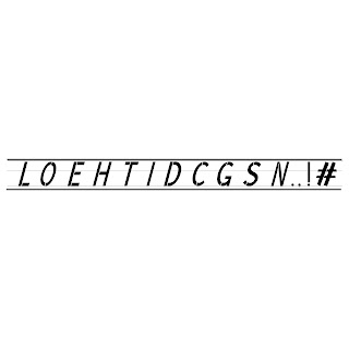
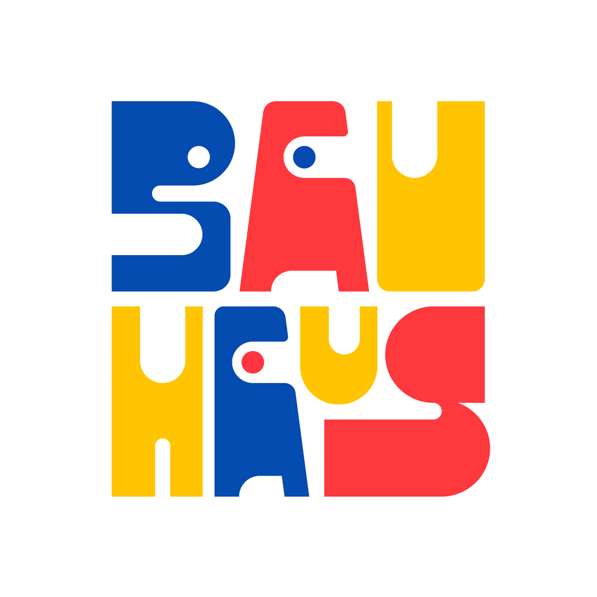
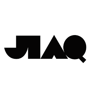
According to the font of last semester, I designed the font according to the design principle of Bauhaus, and on this basis, I will improve the following fonts.
reference


fig 1.8Typographic Exploration and Communication Image reference(16/12/2024)


Because I was inspired by the design principles of Bauhaus and designed all fonts characterised by modern and simple geometric figures.
Because my poster is based on the principle of Bauhaus, the colour used by my poster is relatively simple. The colour is beige, which matches the geometry. As a design element of the poster, it is in line with the principles of Bauhaus.
Application of fonts
I want to add principle of Bauhaus to the product design. I designed canvas bags, subway posters, advertisements, pillows and records.
| fig 3.6 The second attempt(16/12/2024) |
| fig 3.7 The second attempt(16/12/2024) |
| fig 3.8 The second attempt(16/12/2024) |
| fig 3.9 The second attempt(16/12/2024) |
| fig 3.10The second attempt(16/12/2024) |
Task 3FINAL Submission
I named my font Aaron, because it was also my English name, and then I put it everywhere from fontlab8 and installed it on the computer for follow-up testing and font demonstration.
3. FontLab/FontForge screen grab
4. Five font presentations 1024px by 1024px each
The font presentation is inspired by objects in architecture, industrial design and daily life. Through abstract visual symbols, art and design are integrated into daily life, giving the font more emotional expression and artistic atmosphere.
The design integrates experimental innovation concepts, breaks the limitations of traditional fonts, combines artistry and functionality, presents a unique visual language, and conveys modern and future design attitudes.
The copy used in the poster:
1. Design is Thinking Made Visual
2. Modernism: Form Follows Function
3. Break Boundaries, Redefine Visual Language
4. The Beauty of Geometry, The Power of Minimalism
5Design Without Limits, Creativity Without Borders
Feedback
WeeK 13
General feedback: I checked my task one and the task. I browsed my task three according to no problem.
Specific feedback: The submission method of task three is according to the requirements of teams.
Week12
General Feedback:
The course was replaced by public holidays. The teacher tutored the homework online and reminded us that we need to complete task3 before the 13th week.
Week 11
General Feedback:
Can use FontLab or FontForge
Don't forget to name your font
Specific Feedback:After the font is completed, you can take the next step.
week 10:
General feedback: This week, we need to complete the capitalization on the task, and then show it to the teacher. The teacher tells us that the size between each font should be the same.
Special feedback: There is no process of font evolution, and then I think it will be better to continue the font of the second learning task, and then the size and thickness between the fonts should be consistent. Week 9
General feedback: The teacher asked us to focus on task2 in class and let us study the proposal of task three.
Special feedback: When task 2 is completed, you can use the font of the last semester to improve it, so as to complete the capital of task three.
Over the past few weeks, I have received continuous feedback that has helped me improve my font design work and develop a clearer understanding of the tasks.
In Week 9, the teacher emphasized the importance of focusing on Task 2 and encouraged us to use fonts from the previous semester as a foundation to improve and complete the capital letters for Task 3. This feedback made me realize the value of revisiting and refining earlier work rather than starting completely anew, which allows for a more consistent and polished design process.
During Week 10, the focus shifted to ensuring the size and thickness of the fonts were consistent. I was reminded that even minor inconsistencies could affect the overall visual harmony of the typeface. The lack of visible font evolution in my process was pointed out, which prompted me to revisit the second task’s font and develop it further. I now understand that documenting the design evolution is essential for showing progress and thoughtful decision-making.
In Week 11, I received feedback about completing the font and moving forward. The teacher suggested using software like FontLab or FontForge, which are tools I can explore to refine my font’s structure and functionality. Additionally, I was reminded not to overlook naming my font, as this adds a professional touch and identity to the work.
By Week 12, classes were interrupted due to public holidays, but the teacher still provided online tutoring to keep us on track. I was reminded to complete Task 3 before Week 13. This experience taught me the importance of time management and self-discipline, as external interruptions should not delay progress.
Overall, the feedback I received highlighted the importance of consistency in font design, the need to document my process, and the value of refining earlier work. Moving forward, I will focus on applying these suggestions, completing Task 3 with greater attention to detail, and ensuring my font is cohesive, functional, and professionally presented.
Further Reading
Although we can look at typefaces with in the framework of classifcation systems. it is better to examine them in the context in which we see them on the page, so to speak.Traditional systems categorize typefaces by features such as angle of contrast(230).rate of modulation.and shape of serifs.(This partly explains why sans serifs were not classified with the same degree of analysis,) But if we look at typefaces in use,we see that many letterfeatures distort or become less important to overall impression.The darkness of a block of text,the visual reinforce.
ment of horizontal and vertical axes.
the distribution of space within and between letters.the length of a scenders and descenders, and the line spacing 335) become the dominant features. The typeface's overall texture becomes less important than the individual featuresThe presence or absence of comple-mentarystvles and weights within the paragraph and the editorial structure of the text determine our reading strategy.


Comments
Post a Comment