Information Design -Exercises1/2

Information Design Exercises
21/04/2025 - /2025 | Week 1 - Week
Huang jiaqi| 0373820
Information Design| Bachelor of Design in Creative Media
Table of Content
Module Information
LecturesWeek 1
- Understanding the marking rubric of the module.- Read through the module information booklet.
- Choose one random object for next week.
Week 2
- Effective infographics can capture an audience's attention.
- Infographic refers to a powerful way of communicating ideas in a visual form.
Types of InfographicsList Infographics- Informational graphic that uses a written list.
- Contextualising information with visuals makes it easier to read and memorable.
 Figure 1.1 List Infographics
Statistical Infographics- Include pie charts, bar graphs, and other visual representations of data.
- Easier to understand for the audience.
- Percentage radials and branded illustrations help to reel audiences to read the information.
 Figure 1.2 Statistical Infographics
How-to Infographics- Explains how to do something to solve a problem or perform a task.
- Alternative way to describe step-by-step process.
- Make each step of the process easier to absorb.
 Figure 1.3 How-to Infographics
Timeline Infographics- Visually appealing to showcase the timeline.
- Use icons and illustrations of the timeline to represent each point.
 Figure 1.4 Timeline Infographics
Comparison Infographics- Visual way to compare and contrast different options.
- Good for presenting two or more alternatives to help readers understand the distinction between various concepts.
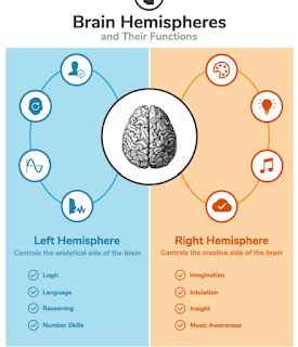 Figure 1.5 Comparison Infographics
Map/Location Infographics- Used mostly by companies and organisations.
- Used to communicate demographic data or other location-specific information.
 Figure 1.6 Map/Location Infographics
Flowchart Infographics- Graphical representation of the sequence of different steps or actions.
- Boost engagement as it resonates closely with the potential audience.
 Figure 1.7 Flowchart Infographics
Process Description Infographics- Describe the main elements and steps of a process.
- Communicate technical information/complex series of actions.
- Highlights the most important steps and simplifies complex ideas.
 Figure 1.8 Process Description Infographics
How Does Creative Process Work?

 Figure 1.9 Creative Process
Week 3
L.A.T.C.H Theory- Organising information meaningfully remains a major challenge for UX designers, regardless of experience or industry.- Even seasoned designers often question the clarity and effectiveness of their structure when starting new projects.
 Figure 2.1 The LATCH System
Location - Technique of organising information based on its location.- Gives a spatial order to the information.
 Figure 2.2 Location
Alphabet- Alphabetical organisation is simple and universally recognised for grouping information.- Labels should align with the user's mental model to ensure clarity and usability.
 Figure 1.3 Alphabet
Time - Organizes information based on time, leveraging the temporal nature of content.- Effective for social media, where users prioritise recent updates from their contacts.
 Figure 1.4 Time
Category - Categorization is the most common method for organising website content, grouping information in ways that are meaningful to users.- Tools like Card Sorting assist in creating user-friendly and relevant categories.
 Figure 1.5 Category
Hierarchy- Arranging information by any order, such as size, cost and popularity,
 Figure 1.6 Hierarchy
Exercises
Exercises 1Instruction:
Gather a set of objects and separate it into category such as color, shape, pattern, and other quantifiable factor.
Example:
1. Box of Lego
2. Jar of button
3. Jar of marble ball
4. Set of colourful rubber strap
In this exercise you're required to quantify our chosen objects and arrange them into a presentable layout or chart.
The information must be presented as is, and you need to arrange the objects with relevant indicators written out with pens to help you to visualize the quantity and data. The examples of objects that can be use are buttons, coins, lego pieces, M&Ms, and more
I went to the store to buy DIY materials, and I decided to use wooden sticks.
I classified the wooden sticks of different colors and arranged them on A4 paper.
At the beginning, I randomly put the necessary sticks on the paper.
- Photos of random objects before classification
 fig 3.1 random objects
- Objects sorted by category
I simply categorize by color
 fig 3.2 sort by colorI sorted them by quantity
 fig 3.3 sort by quantity
Next, I will classify emotions.
 fig 3.4 will classify emotions.
Data visualization final resultTitle: The Emotional Staircase of a Day
Statement:
The Emotional Staircase of a Day visualizes the shifting emotional states across different times of day using a staircase form and six distinct colors, each representing a unique emotion. The structure reflects the ups and downs of daily moods, portraying a personal emotional journey from morning to night:
Blue (Morning): A sense of melancholy and reluctance to wake up marks the emotional low point of the day.
Green (Late Morning): Calmness emerges as focus and productivity begin to take shape.
Yellow (Noon): Joy and relaxation peak during lunchtime—a bright emotional highlight.
Orange (Afternoon): Energy rises, resulting in a productive and dynamic part of the day.
Red (Evening): Fatigue and slight irritability surface after a long day.
Purple (Night): A sense of pressure and introspection settles in while preparing for the next day.
This staircase metaphor not only records the intensity of emotions throughout the day but also encourages the audience to acknowledge and reflect on the subtle emotional transitions we experience daily. It reminds us that emotions are not linear—they flow, build, fade, and often return, forming the rhythm of our lived experience.

fig 3.5 Data visualization final result
This ascending order reflects the increasing intensity of emotions and metaphorically illustrates the transition from deep, internal feelings to more visible, external expressions. The tower structure implies that emotions, like architecture, can be both solid and fragile—when one layer becomes unstable, the whole system may collapse.
The work invites viewers to reflect: How do our emotions pile up throughout daily life? Do we consciously rebuild or rebalance these layers? Emotion Tower seeks to materialize abstract emotional states and encourage greater self-awareness and emotional resilience.
- Choose one random object for next week.
- Infographic refers to a powerful way of communicating ideas in a visual form.
- Contextualising information with visuals makes it easier to read and memorable.

- Easier to understand for the audience.
- Percentage radials and branded illustrations help to reel audiences to read the information.

- Alternative way to describe step-by-step process.
- Make each step of the process easier to absorb.

- Use icons and illustrations of the timeline to represent each point.

- Good for presenting two or more alternatives to help readers understand the distinction between various concepts.

- Used to communicate demographic data or other location-specific information.

- Boost engagement as it resonates closely with the potential audience.

- Communicate technical information/complex series of actions.
- Highlights the most important steps and simplifies complex ideas.


Gather a set of objects and separate it into category such as color, shape, pattern, and other quantifiable factor.
Example:
1. Box of Lego
2. Jar of button
3. Jar of marble ball
4. Set of colourful rubber strap
In this exercise you're required to quantify our chosen objects and arrange them into a presentable layout or chart.
The information must be presented as is, and you need to arrange the objects with relevant indicators written out with pens to help you to visualize the quantity and data. The examples of objects that can be use are buttons, coins, lego pieces, M&Ms, and more
- Photos of random objects before classification

- Objects sorted by category


Title: The Emotional Staircase of a Day
Statement:
The Emotional Staircase of a Day visualizes the shifting emotional states across different times of day using a staircase form and six distinct colors, each representing a unique emotion. The structure reflects the ups and downs of daily moods, portraying a personal emotional journey from morning to night:
Blue (Morning): A sense of melancholy and reluctance to wake up marks the emotional low point of the day.
Green (Late Morning): Calmness emerges as focus and productivity begin to take shape.
Yellow (Noon): Joy and relaxation peak during lunchtime—a bright emotional highlight.
Orange (Afternoon): Energy rises, resulting in a productive and dynamic part of the day.
Red (Evening): Fatigue and slight irritability surface after a long day.
Purple (Night): A sense of pressure and introspection settles in while preparing for the next day.
This staircase metaphor not only records the intensity of emotions throughout the day but also encourages the audience to acknowledge and reflect on the subtle emotional transitions we experience daily. It reminds us that emotions are not linear—they flow, build, fade, and often return, forming the rhythm of our lived experience.

| fig 3.5 Data visualization final result |
This ascending order reflects the increasing intensity of emotions and metaphorically illustrates the transition from deep, internal feelings to more visible, external expressions. The tower structure implies that emotions, like architecture, can be both solid and fragile—when one layer becomes unstable, the whole system may collapse.
The work invites viewers to reflect: How do our emotions pile up throughout daily life? Do we consciously rebuild or rebalance these layers? Emotion Tower seeks to materialize abstract emotional states and encourage greater self-awareness and emotional resilience.
Exercises 2
INSTRUCTION:
1. Organize a group of information into a visual poster that combines and utilizes the LATCH principles (Minimum 4).
2. You are required to use the digital photo editing/illustration software available to assemble the information into a LATCH infographic poster.
3. You are allowed to reuse back the images but you have to create the rest of visuals to complete the poster.
REQUIREMENTS:
1. Size resolution: A4 size
2. Progress and submission link on E-Portfolio.
SUBMISSION:
1. Final poster attached to this submission.
2. E-Portfolio link attached to this submission.
I searched for relevant poster references online
 fig 3.6 references online
I searched for relevant poster references online

A Timeline of Western Philosophers
Concept Overview:
This infographic visually maps the evolution of Western philosophy through seven iconic thinkers, from ancient Greece to modern Europe. By applying the LATCH principle—Location, Alphabet, Time, Category, Hierarchy—the poster provides a multi-dimensional narrative that is both informative and aesthetically cohesive.
Process
1. Data organisation
The information of seven philosophers has been collected:
Plato (Plato)
Aristotle (Aristotle)
Kant (Kant)
Nietzsche (Nietzsche)
Heidegger (Heidegger)
Wittgenstein (Wittgenstein)
Simone de Beauvoir (Simone de Beauvoir)
Organise the year of birth, country, philosophical school, core ideas, etc.
APPLICATION OF THE LATCH PRINCIPLE
Time: The philosophers are arranged from early to late by year of birth to form a timeline.
Location: Mark their birthplace on the European map and visualise the geographical distribution.
Category: Different colours are designed for different philosophical schools (such as idealism, empiricism, existentialism, feminism, etc.).
Hierarchy (Hierarchy): The historical influence of philosophers is hinted at by the size of the image or the amount of information.

fig 3.7 Create a light-coloured background

fig 3.8 Adjust the desired colour
TimeI use the time axis structure to arrange the seven Western philosophers in order of their year of birth from ancient times to the present, extending from the ancient Greek Plato (427 BC) to Simone de Beauvoir in the 20th century (1908 Year of birth).
This linear sorting method allows viewers to see at a glance how philosophical ideas are constantly evolving and changing in the long history, reflecting the philosophical focusses and changing trends of different historical stages. For example:
Classical philosophy (Plato, Aristote) emphasises rationality and form;
The Age of Enlightenment (Kant) promotes rational criticism and the boundaries of knowledge;
Modern philosophy (Nietzsche, Heidegger, Wittgenstein, Bovova) focusses on issues such as individual, survival, language and gender.

fig 3.9 Add materials and organise time
Location
I accurately marked the birthplace or main activity of each philosopher on the European map in the infographic, such as:
Plato and Aristotle are both from Athens, Greece;
Kant was born in Prussia (now Kaliningrad, Russia);
Bauvoir was born and active in Paris, France;
Nietzsche and Heidegger came from Germany;
Wittgenstein was born in Vienna, Austria.
This design allows readers to see the gathering of philosophical ideas in different cultural centres, such as the outbreak of German philosophy in the 19th century and the status of ancient Greece as the birthplace of philosophy, which also reflects the geographical spread of philosophy on the European continent.

fig 3.10 Planning and layout

| fig 3.7 Create a light-coloured background |

| fig 3.8 Adjust the desired colour |

| fig 3.9 Add materials and organise time |

| fig 3.10 Planning and layout |
Category
In order to strengthen the recognition, we have designed exclusive colour logos and icons for different philosophical schools to visually show the ideological belonging of each philosopher.

fig 3.11 Preliminary completion
HierarchyUse the star rating to markThis implicit hierarchy expresses the subtle differences between philosophers in "historical positioning" and "modern influence", which not only loses fairness, but also strengthens visual guidance.

fig 3.12 Add images

fig 3.13 Cropping and retouching images

fig 3.14 The final output

| fig 3.11 Preliminary completion |

| fig 3.12 Add images |

| fig 3.13 Cropping and retouching images |

| fig 3.14 The final output |
The final result
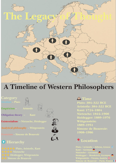
fig 3.15The final result
Final Outcome - L.A.T.C.H. Infographic Poster (PDF)

| fig 3.15The final result |
4. Feedback
week2
During the display, the tutor gave a positive evaluation. He believes that the conception of the work has a sense of hierarchy, and the use of color accurately conveys the progression and change of emotions. He especially appreciates the "tower", which is a structural metaphor for the concept of both stable and fragile human emotional system, which has a strong symbolic meaning.
5. Reflection
week2
Creating Emotion Tower deepened my understanding that emotions are not only personal feelings but can also be expressed visually and structurally as an internal language. By combining color and form, I aimed to give shape to the abstract. During the construction process, I realized that emotions are not merely linear but part of a complex system that overlaps, interferes, and sometimes contradicts itself. Moving forward, I hope to further explore the interaction between emotion and form, and possibly incorporate audience participation to make the work a more resonant emotional medium.
Experience The method of completing these works out was both challenging and fulfilling. At to begin with, the assignment appeared straightforward - make a blurb that communicates data clearly and proficiently. Be that as it may, I soon realized that the method was more than basically joining information and visual components, and required an understanding of the hook rule, which is to permit the group of onlookers to quickly get it the data without being confounded or overpowered.
One of the key challenges was narrowing the scope of the blurb. At first, I needed to incorporate as much data as conceivable, but rapidly found that this would lead to cluttered and confounding substance. Instep, I learned to center on a particular point and show it in a outwardly engaging and easy-to-understand way. In addition, inquiring about point by point and precise data could be a key step. I went through a parcel of time collecting information from dependable sources online, guaranteeing that the data included was both pertinent and precise.
ObservationsVisual pecking order is imperative: prioritizing data through measure, color, and arrangement can direct the viewer's eye and make the blurb simpler to studied. Adjust of content and visual components: Finding the correct adjust between content data and visual components is significant. As well much content can make the blurb see thick, whereas visual components without setting can delude the watcher.
FindingsThe hook rule may be a capable instrument: by centering on making information quickly justifiable, I am able to make plans that are both functional and appealing. This guideline has fortified for me that great plan isn't close to aesthetics, but almost viable communication. Research is essential: exact and nitty gritty data is at the heart of any successful data plan. Without strong information, indeed the foremost outwardly engaging plan will come up short to communicate successfully.
5. Reflection
week2
Creating Emotion Tower deepened my understanding that emotions are not only personal feelings but can also be expressed visually and structurally as an internal language. By combining color and form, I aimed to give shape to the abstract. During the construction process, I realized that emotions are not merely linear but part of a complex system that overlaps, interferes, and sometimes contradicts itself. Moving forward, I hope to further explore the interaction between emotion and form, and possibly incorporate audience participation to make the work a more resonant emotional medium.


Comments
Post a Comment